Given health care reform has been a major topic among citizens and elected representatives over the past year, it seems appropriate to post a few links to thought provoking graphics and articles. There are several countries for leaders to benchmark regarding implementing or reforming a health care plan.
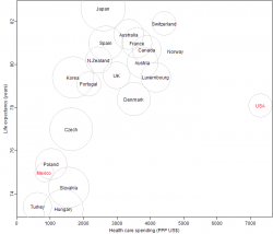
Below is a scatter-plot presented by the blog FiveThirtyEight depicting health care spending and life expectancy (click to enlarge).
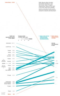
For a different perspective, National Geographic Magazine presented a linear graphic of health care expenditures and life expectancy (below):
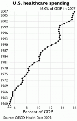
And, lastly, the Organization of Economic Co-Operation and Development (OECD) presents an overview and offers an interactive visual related to health care expenditures and effectiveness, and Wikipedia includes several charts and resources for further research, including a revealing chart of U.S. health care expenditures as a percentage of GDP (below).


PS> U.S. health care quality is #37 on the planet1 France 2 Italy 3 San Marino 4 Andorra 5 Malta 6 Singapore 7 Spain 8 Oman 9 Austria 10 Japan 11 Norway 12 Portugal 13 Monaco 14 Greece 15 Iceland 16 Luxembourg 17 Netherlands 18 United Kingdom 19 Ireland 20 Switzerland 21 Belgium 22 Colombia 23 Sweden 24 Cyprus 25 Germany 26 Saudi Arabia 27 United Arab Emirates 28 Israel 29 Morocco 30 Canada 31 Finland 32 Australia 33 Chile 34 Denmark 35 Dominica 36 Costa Rica 37 United States of America 38 Slovenia 39 Cuba The World Health Organization’s rankingof the world’s health systemshttps://www.photius.com/rankings/healthranks.html